The fastest video player… ever
That’s right. Aurora is the smallest, most lightweight player on the market, so your videos play at lightning speed.
Plays as good as it looks
What happens when you combine lightning-fast video playback with a sleek, customizable player? You’re lookin’ at it.
If you can dream it, you can do it with the Wistia player.
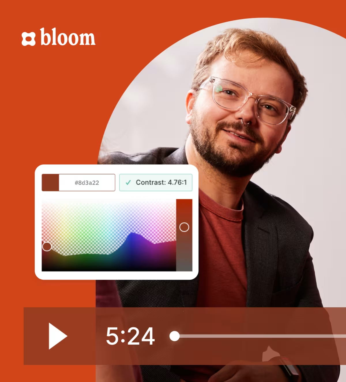
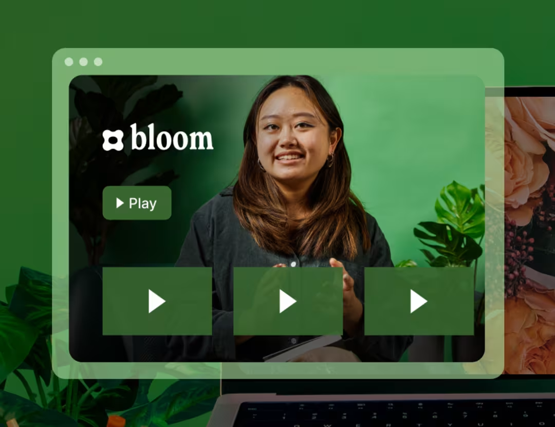
Change the logo, thumbnail, color, and more with the tap of a finger.
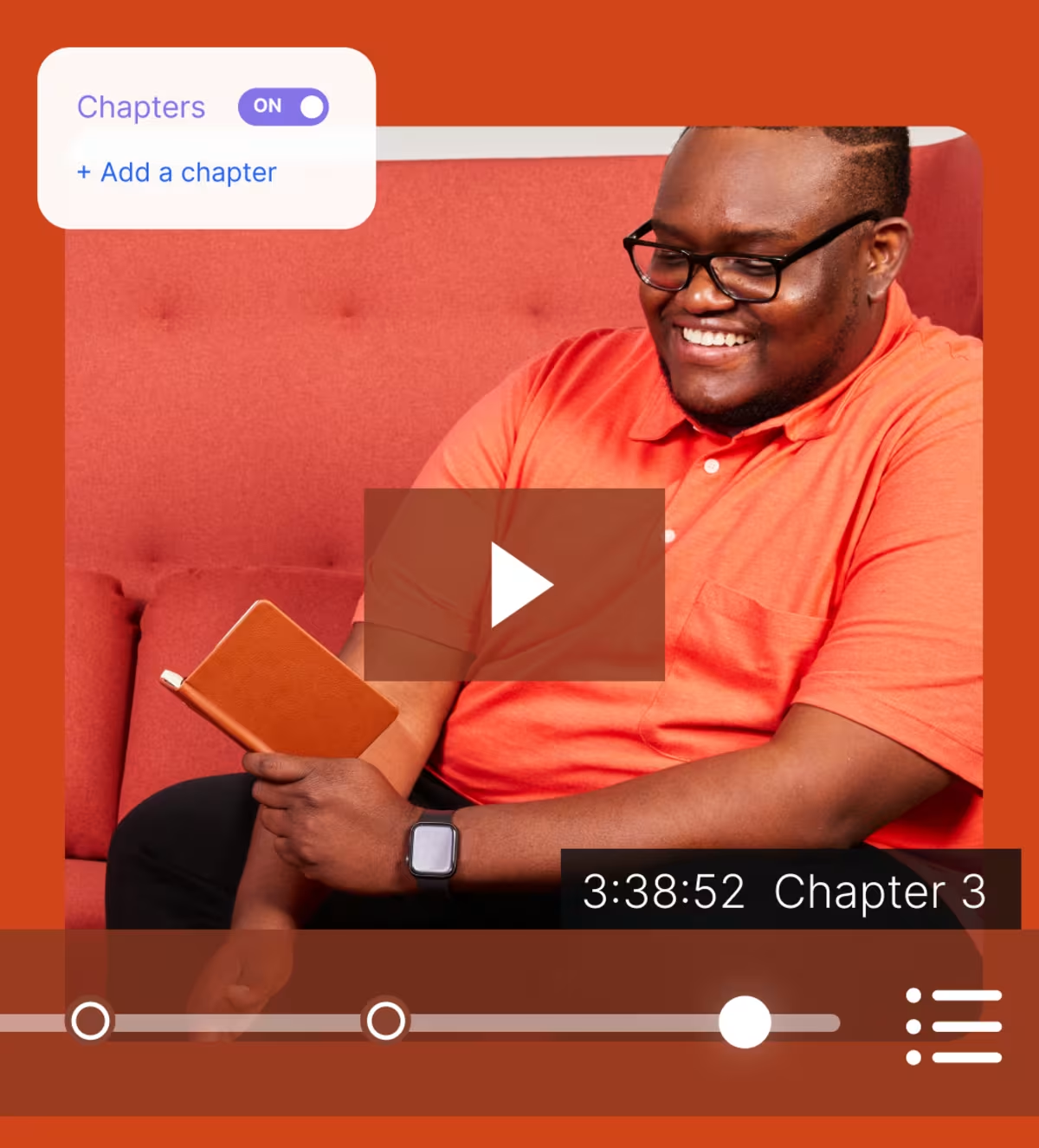
Add video chapters, remove the playbar, and even adjust the playback controls your audience sees.
That’s right. Aurora is the smallest, most lightweight player on the market, so your videos play at lightning speed.
We make sure your videos look great everywhere, from mobile devices to giant screens.
Your viewers get uninterrupted playback, no matter their connection speed.
We’ll deliver your videos exactly as you intended—at their highest quality up to 4K.
Your videos are always ad-free, which makes visitors more likely to stick around on your site.
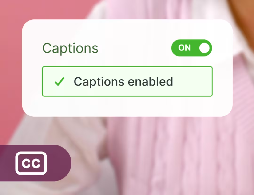
Add audio descriptions, captions, and high-contrast visuals with our WCAG AA-compliant player.
Easily spin up stunning pages for your videos, podcasts, or branded series with Wistia Channels. No coding required.
A great-looking player is nice, but a great-looking player that helps you grow and nurture your customer base? Even better.
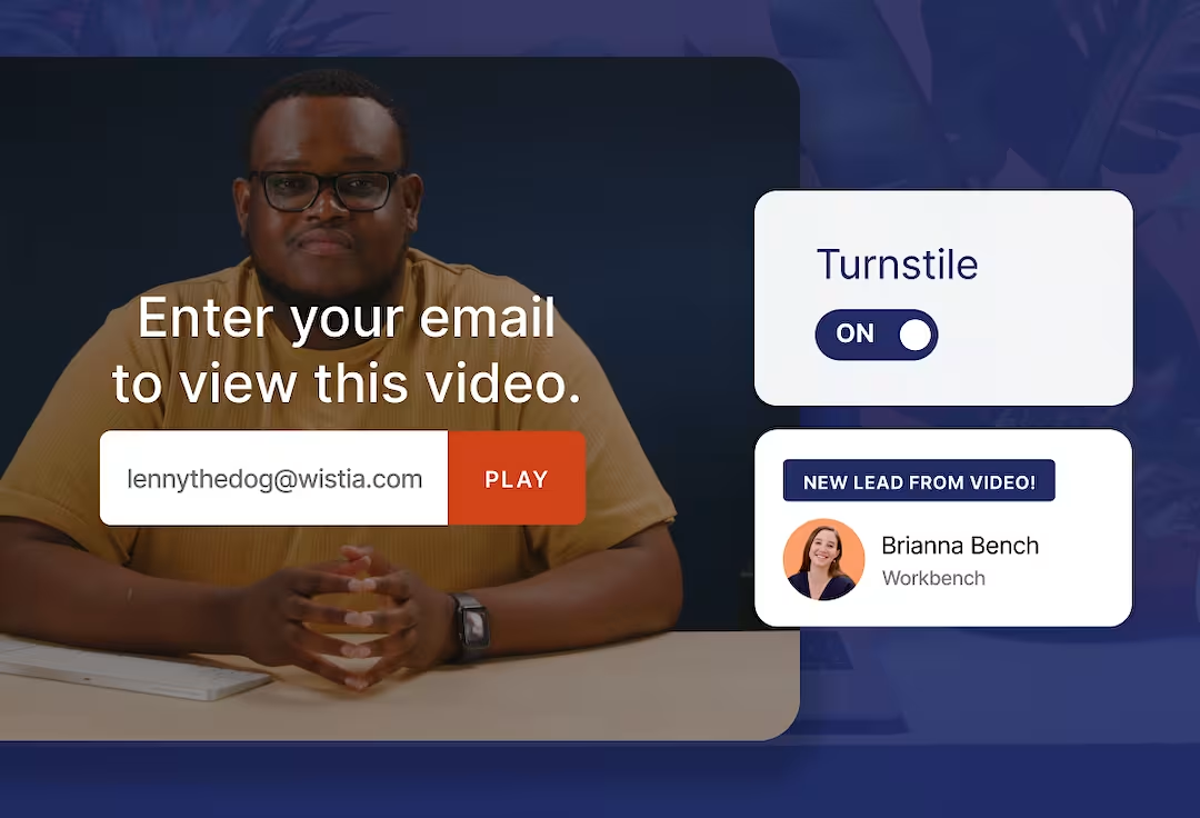
Capture viewers’ email addresses and integrate Wistia with HubSpot, Pardot, or Marketo.
Use annotation links and custom calls to action to help viewers get where they need to go next.
“The Wistia player is lightning-fast, videos load instantly, and look fantastic. It’s become an essential part of how Highline Studios shares and measures the impact of our videos.”
Damon Hoydysh Founder | Highline Studios
See how they stack up on the stuff that really matters, like branding, analytics, integrations, and more.
Read on
We’ve got all the tools you need to squeeze more juice out of your videos.

Create super polished videos with just your laptop.
Zhuzhing up your videos has never been easier.
We’ve made getting feedback simple and fun. Really!
Store, organize, find, and archive your videos in a jiffy.
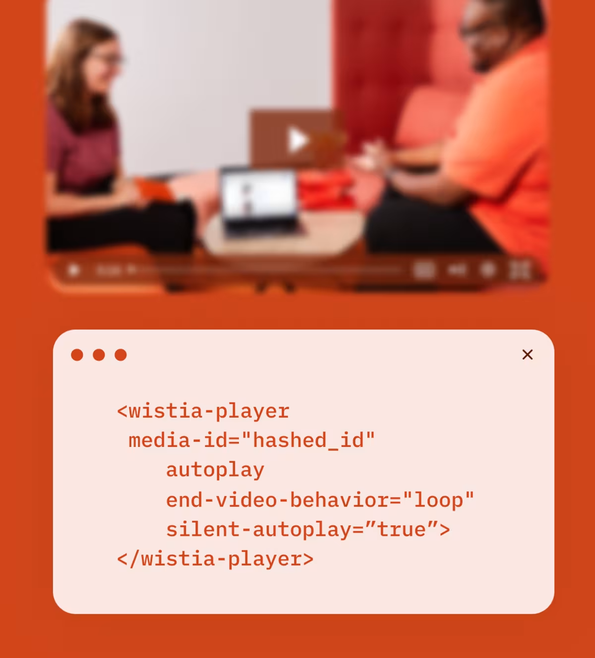
Copy and paste our embed code onto your page for reliable playback on any device.
Hosting webinars is now a piece of cake. Preferably red velvet.
Get nerdy with key metrics, heatmaps, and A/B testing at your fingertips.
Automatically send video data to your favorite marketing tools.
Upload your pod and we’ll distribute it to top directories like Apple and Spotify.
We automatically optimize your videos for search to get you more views.
Build custom video experiences for your site.
AI dubbing and translations in 50+ languages.
Everything you need to create an inclusive video experience.
Get all the As to your FAQ’s
An online video player is a software application or web-based tool that plays videos on any computer, mobile device, or any other web browser with internet access. Online video players give users the ability to play, pause, rewind, fast-forward, and adjust the playback speed and volume of video content. Browser-based video players offer support for subtitles or closed captions as well, which makes watching videos online more accessible for everyone.
We might be biased, but we think you should go with a complete video platform. A good one like Wistia offers advanced tools and a centralized hub for your team to host, manage, and do more to market your business with your entire media library.
With Wistia, you can seamlessly embed and share videos to your social media accounts from one place, host live webinars and video podcasts, integrate your video library with your other marketing tools, and better understand your overall video performance with detailed video analytics.
Some common video file formats include MP4, H.264, H.265, MOV, WMV, AVI, AVCHD, FLV, F4V, SWF, MKV, WEBM, and HTML5. The good news? Wistia supports all of these formats and more so that all your video files play back seamlessly.
You can—and you should! Customizing your player to match your brand or the web page where your video lives can offer a more polished viewing experience for your audience.
With Wistia, you can customize your video player to include your brand’s logo, colors, and style. You can add chapters for better navigation, include subtitles for greater accessibility, round the player’s corners, choose player controls, and update the privacy settings. Wistia also helps you engage your viewers and collect leads right within your video player with advanced features like in-video lead capture forms, annotation links, and calls to action. If you’re looking for even deeper customization, you’re in luck. Wistia’s super flexible player API gives you a ton of control over the look, feel, and functionality of your video player.