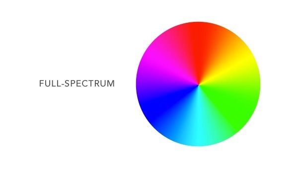
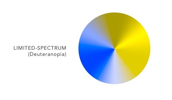
Color blindness is a very tricky thing. Quite a few people are color blind in one way or another, though very few see the world as if it were a black-and-white TV (a common misconception). The vast majority (as much as 8% of men) see most of the color spectrum but have difficulty seeing red and green. Without red or green, for example, purple appears as blue. Orange just looks like a murkier yellow, and so does green. Hover over the color wheel to see for yourself.
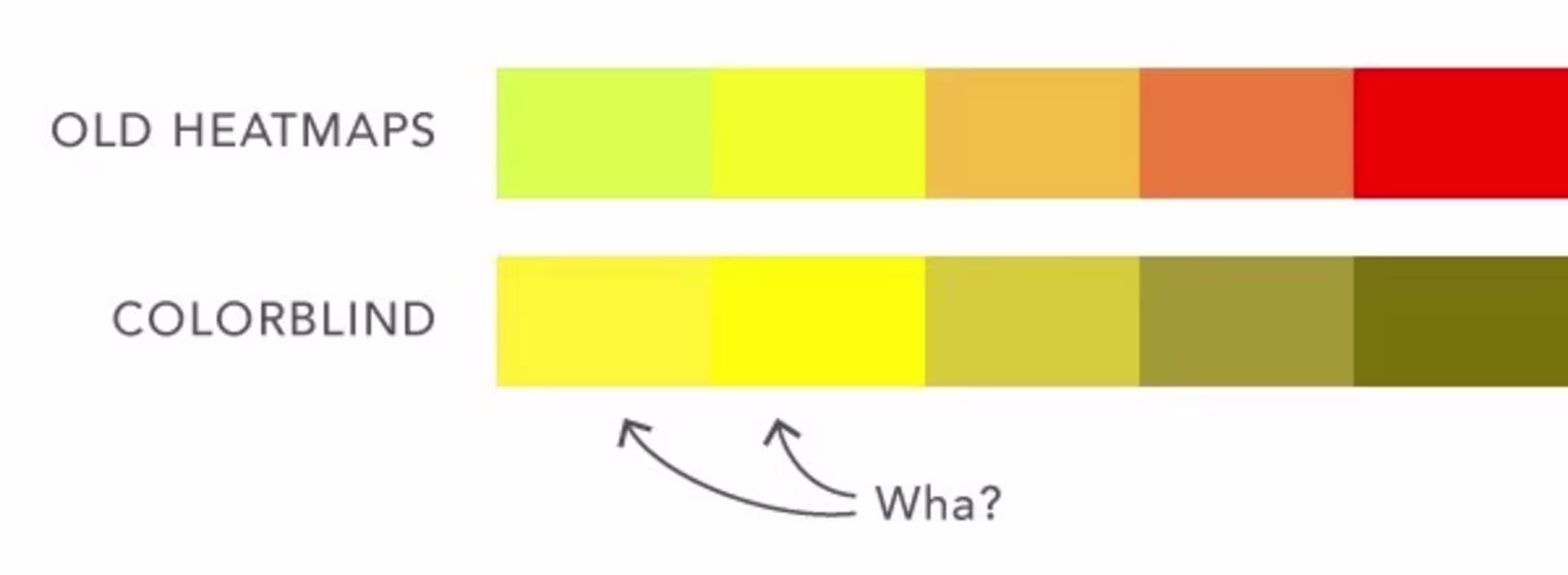
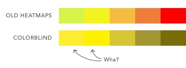
That makes a lot of things tricky. Sideways stop lights, for instance. Also, Wistia heatmaps. We’ve been relying on our green-yellow-orange-red palette for years; it wasn’t until a user pointed out our oversight (pun) that we realized we had a problem.
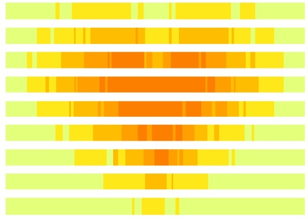
Heatmaps are a lot of people’s favorite thing about Wistia, and our colors were outside the range of 1 in 12 users. The challenge was to find new heatmap colors that would be legible to the most common type of color blindness (deuteranopia), but still retain the intuitive warmer-as-it-gets-watched-more analogy.
Finding a set of colors that looks good under both conditions was no easy task. The distinction between green and yellow is virtually nonexistent to the color blind, but it happens to be the most important contrast in our heatmaps because it separates watches from rewatches. Here’s what our old spectrum looked like. Hover to see how it looks now:
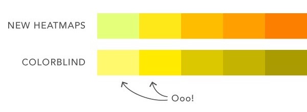
To find the perfect balance, we set up a single heatmap with a color picker for each color, as well as a limited-spectrum version of the same heatmap. The filter transformed the red- and green-values of each color, according to an algorithm by Tom MacWright that we found on github.
Another helpful tool is Adobe’s color blind filters, which are powerful and extremely easy to use. In Illustrator, just go to View > Proof Setup > Color Blindness - Deuteranopia-type, and immediately see how your design looks in a limited spectrum.
All that to say, if you noticed that your heatmaps look a little different, good eye! You’re right, we changed them. If you noticed that your heatmaps look a million times better, you’re probably color blind. Sorry about the illegible heatmaps we’ve been showing you.