
State of Video Report: Video Marketing Statistics for 2026
Build a stronger video marketing strategy this year with our latest video marketing statistics on performance, creation, distribution, and generative artificial intelligence (AI).
Video AnalyticsVideo MCP, Explained: How to Turn Your AI Agent into a Video Assistant
A video MCP connects your AI agent to your video library so you can prompt it to manage your videos, report on performance, and more. See what you can do with Wistia’s video MCP.
Video ProductionWistia vs. YouTube: What's the Difference?
YouTube offers reach and Wistia offers control, and the best video marketing strategies use both together.
Video DistributionThe Best Practices for Adding Lead Gen Forms to Your Videos
Get data-backed insights on the types of videos that capture the most leads, the best places to put a form in your videos, and more.
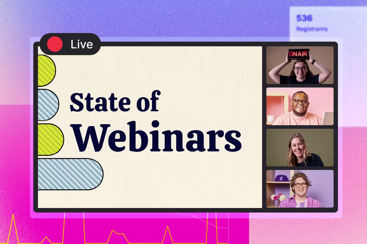
Video DistributionJune Product Spotlight: A Big Few Months for Webinars
We shipped new editing tools like Remix, better team controls, and more ways to make your videos feel like your own.
WebinarsWistia Guides
Customer Story
How Reddit Grew Their Webinar Program 4x
Reddit’s SMB team went from one webinar a month to four and used Wistia analytics to build a pipeline machine.
Read the story
Browse by category
Video Strategy
See more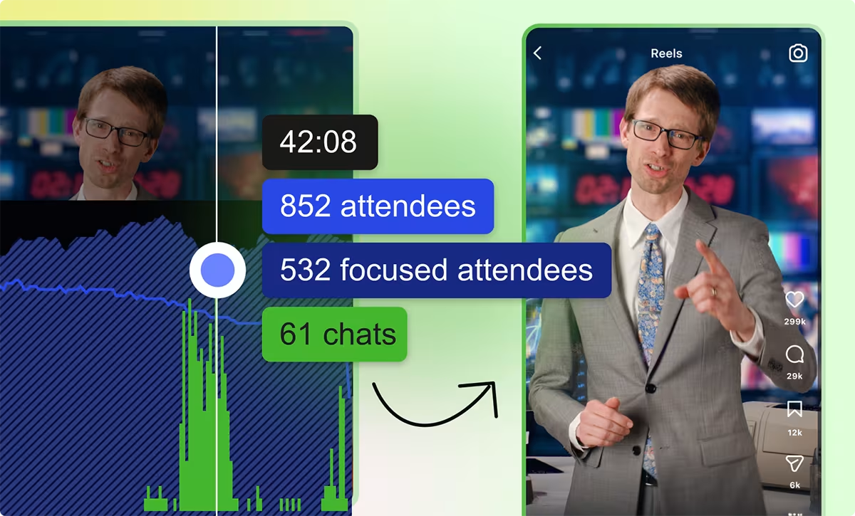
Webinar Analytics Playbook: How to Build a Smarter Follow-up Strategy with the Right Data
Granular engagement data is the secret ingredient for sending targeted follow-ups and knowing what to repurpose. Here's how we use it.
Meg Dalessandro
The Video Strategy Shifts Worth Making Now, Based on Our Latest Research
Wistia's Head of Content digs into the 2026 State of Video Report data to surface how your team should make videos and where you should distribute them in the next 12 months.
Sam Balter
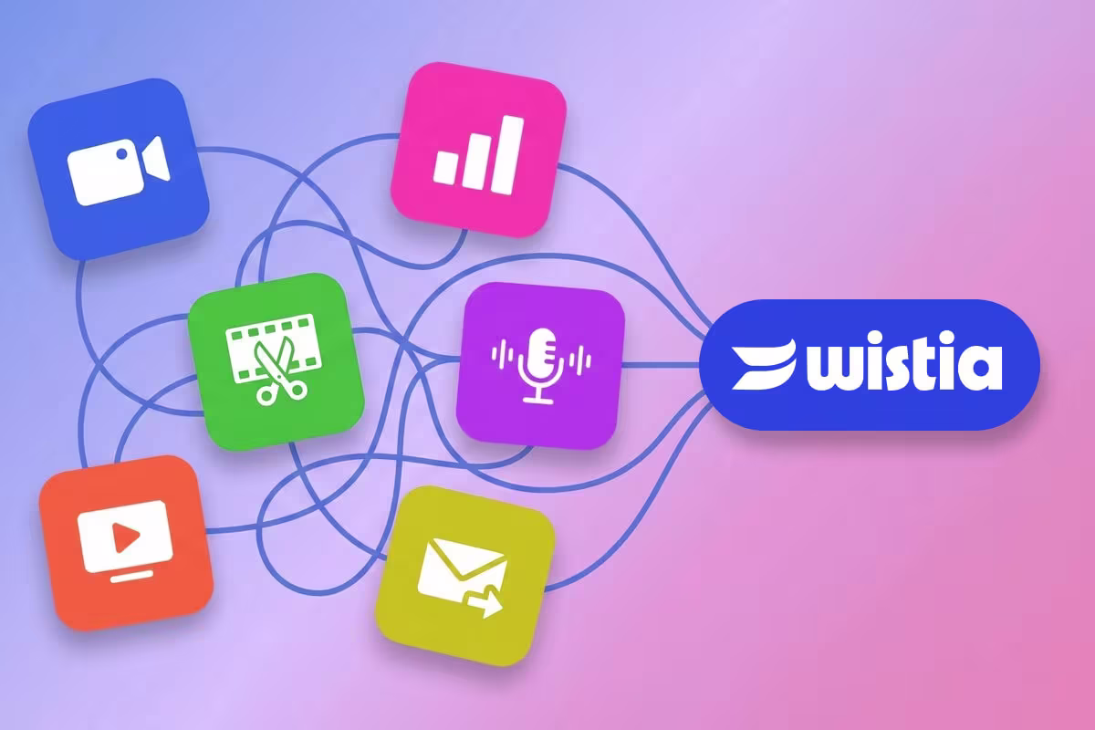
The Key to an Easier Video Workflow: Consolidating Your Tools
See how doing all your video stuff in one place like Wistia reduces handoffs, speeds up production, and cuts costs.
James Zabik
Video Production
See more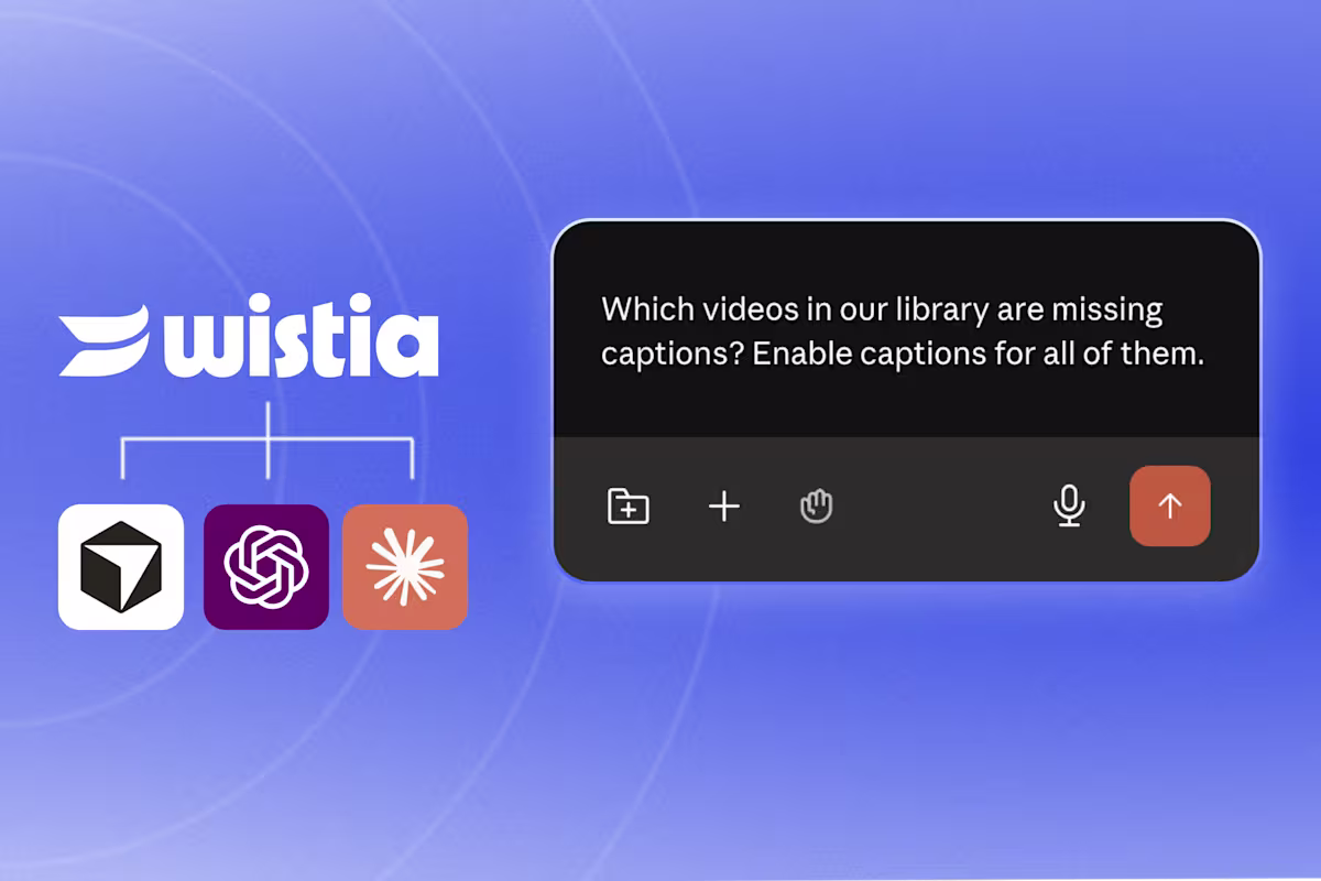
Video MCP, Explained: How to Turn Your AI Agent into a Video Assistant
A video MCP connects your AI agent to your video library so you can prompt it to manage your videos, report on performance, and more. See what you can do with Wistia’s video MCP.
Sam Balter
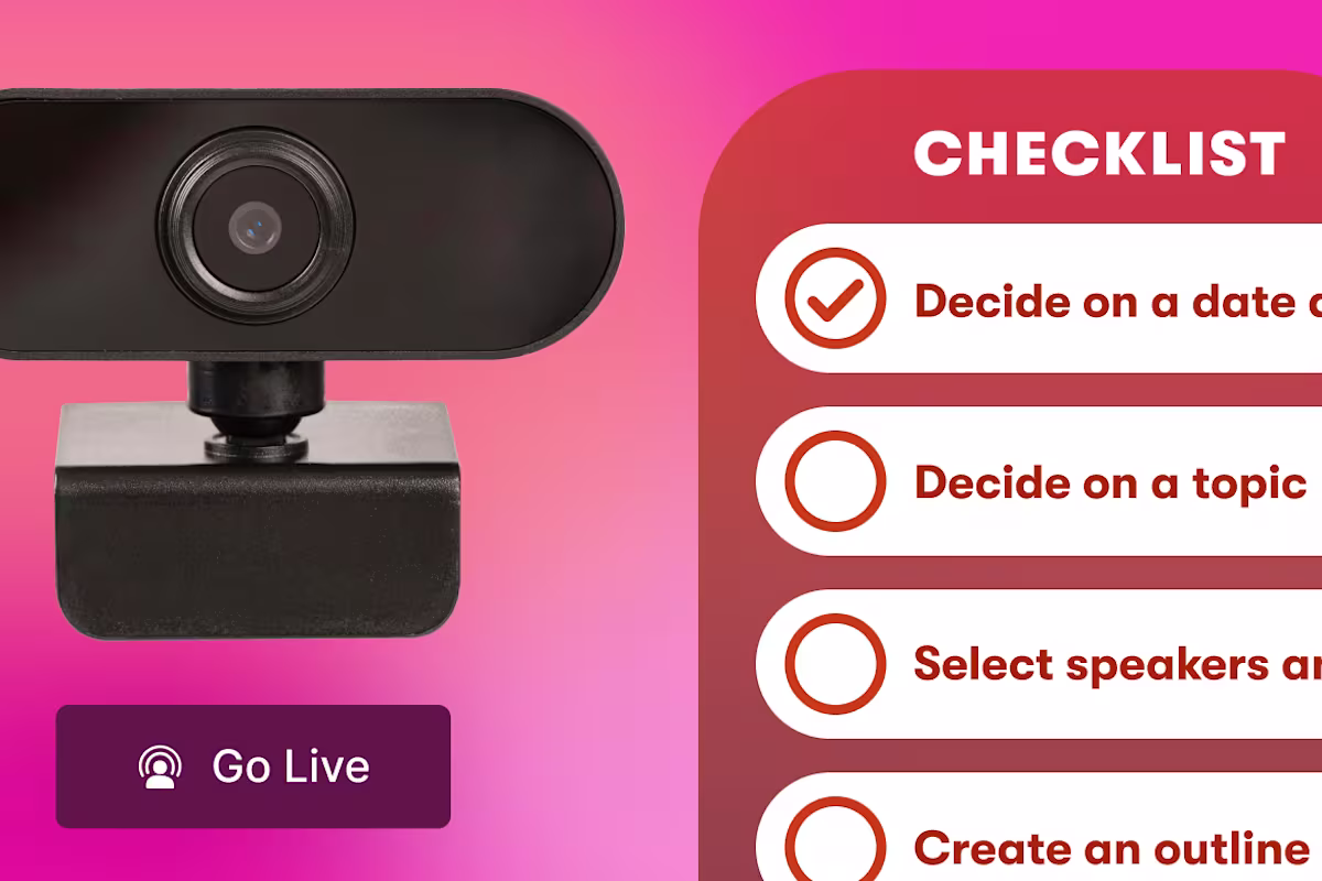
Webinar Checklist: How to Plan, Host & Follow Up on a Successful Webinar
A week-by-week webinar checklist covering planning, promotion, going live, and post-event follow-up.
Lisa Marinelli
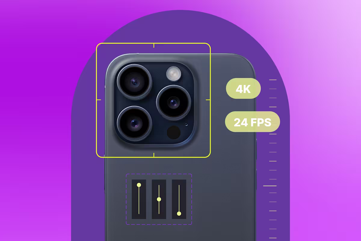
The Best iPhone Camera Settings for Video
Walk through all the settings to adjust on your iPhone for high-quality footage.
Chris Lavigne
Editing
See more
AI Video Creation Guide: How to Use AI to Create Videos
Learn how to use AI to create videos for your business. From scripting to editing, generative AI is making video production easier than ever.
Chris Lavigne
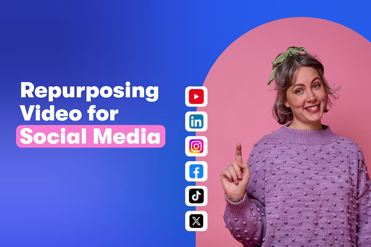
9 Tips for Repurposing Videos for Social Media
Turn your video library into a steady stream of engaging social content.
Lisa Marinelli

How We Made A Fully Animated Short with AI and the Nuances of AI Video Generation
Learn how we reimagined an old video from our archive into a brand-new AI-generated animated short in a week.
Chris Lavigne
Webinars
See more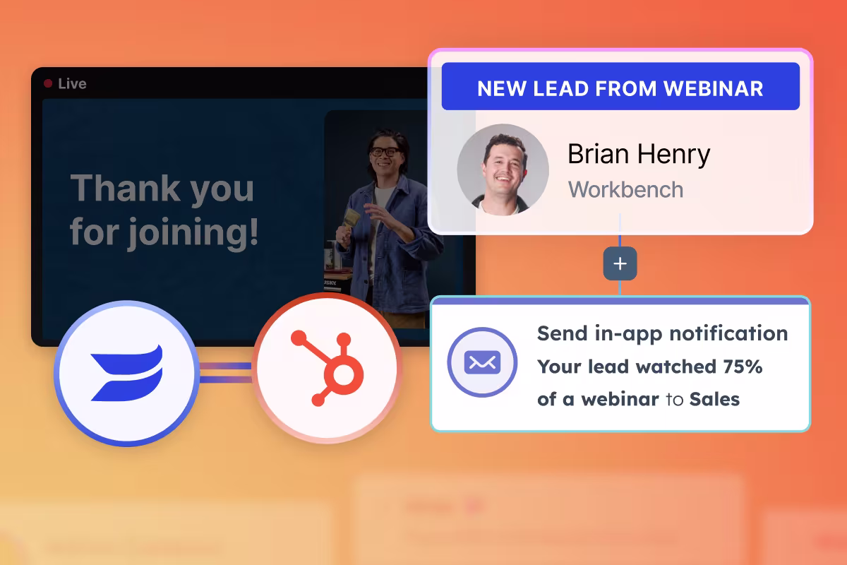
How to Turn Wistia’s Granular Webinar Data Into Revenue with HubSpot
Wistia gives you the audience engagement signals other platforms miss, and you can turn them into scored leads, warmer sales conversations, and a clear line from webinar to closed deal. See this in practice with HubSpot.
Meg Dalessandro

How to Run More Engaging Webinars: 5 Expert Tips
Public speaking advisor Jay Acunzo shares his webinar best practices to turn your flat events into wins.
Meg Dalessandro

June Product Spotlight: A Big Few Months for Webinars
We shipped new editing tools like Remix, better team controls, and more ways to make your videos feel like your own.
Sasha Friedman
Podcasting
See more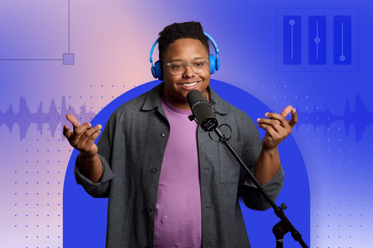
7 Great Reasons to Start a Podcast for Your Business
Discover 7 profitable reasons to start a podcast for your business and build trust, grow your audience, and boost your brand visibility.
Chiara Hoogervorst
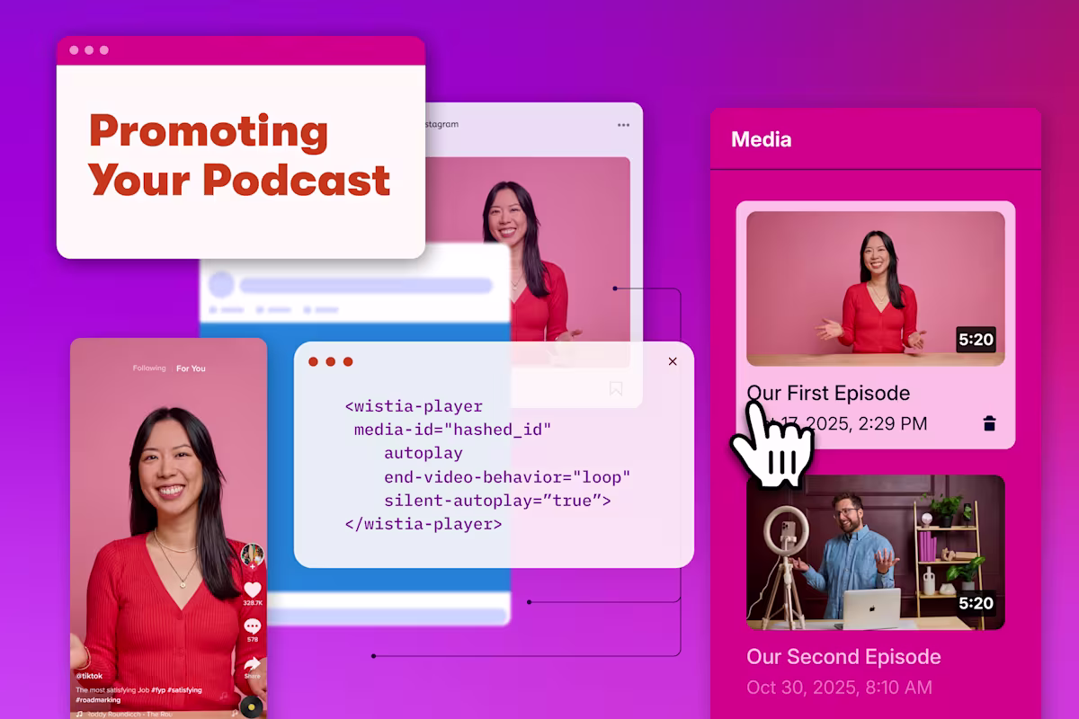
17 Ways to Promote Your Podcast like a Pro
Get the best practices for distributing your podcast and getting folks to hit play.
Chiara Hoogervorst
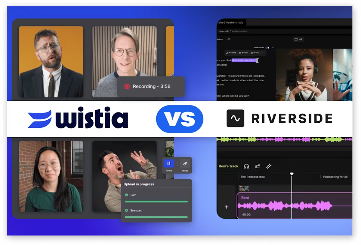
Wistia vs. Riverside: Which Remote Recording Platform Is Right for You?
Both deliver studio-quality remote recordings, but Wistia carries the recording all the way through branding, editing, and publishing to your audience.
Courtney Lefferts
Video Distribution
See more
How to Use Wistia and YouTube Together
Integrate the advantages of both video hosting platforms into your marketing strategy.
Phil Nottingham
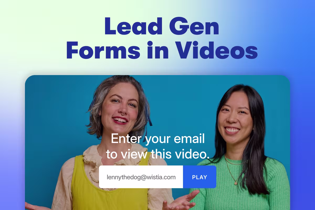
The Best Practices for Adding Lead Gen Forms to Your Videos
Get data-backed insights on the types of videos that capture the most leads, the best places to put a form in your videos, and more.
Chiara Hoogervorst
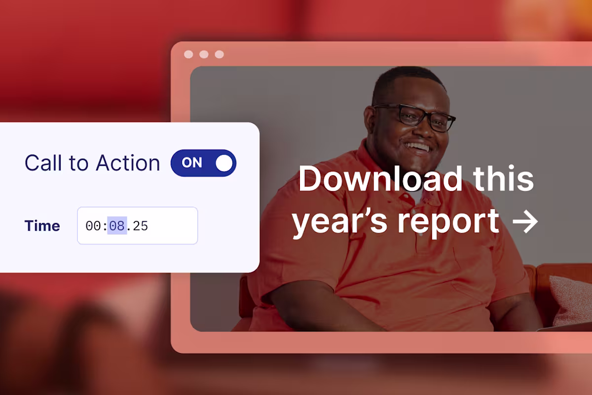
How to Add a Video CTA to Increase Conversions
Learn how to add a call to action to videos and how to optimize for conversion rates.
Lisa Marinelli
Video Analytics
See more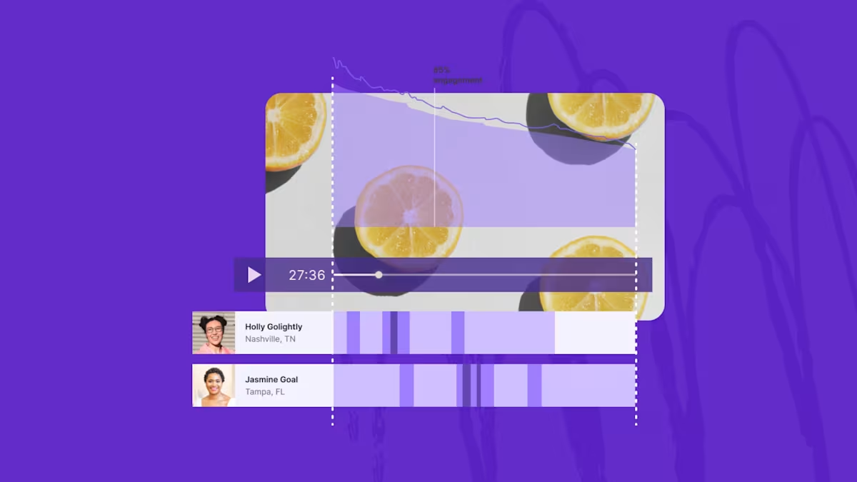
How to Track Video Metrics and Performance with Analytics
Discover what video metrics to track for engagement, conversion assists, and ROI of your next video.
Lisa Marinelli

State of Video Report: Video Marketing Statistics for 2026
Build a stronger video marketing strategy this year with our latest video marketing statistics on performance, creation, distribution, and generative artificial intelligence (AI).
Lisa Marinelli
2026 Industry Benchmarks for Your Webinar Analytics
Discover webinar benchmarks for 2026, including registration and attendance rates based on data from 900+ marketers and all the webinars hosted on Wistia.
Lisa Marinelli
Wistia Updates
See more
A Recap of Wistia’s 2026 Town Hall
See how our latest features are helping solve the biggest challenges marketers are facing these days.
Chiara Hoogervorst
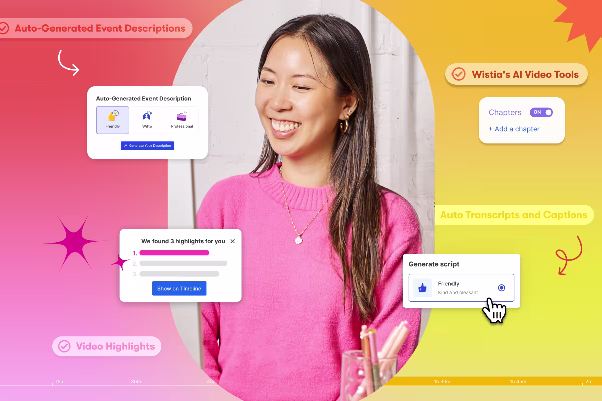
How to Enhance Your Creativity with Wistia’s AI Video Tools
Kickstart scripts, clean up recordings, and repurpose footage in a few clicks, so you can spend less time on busywork and more on ideas.
Sasha Friedman

Our Top 25 Features of ‘25
Here's our roundup of our favorite features we've shipped this year that'll help you create faster, edit smarter, and much more!
Sasha Friedman
Customer Stories
See more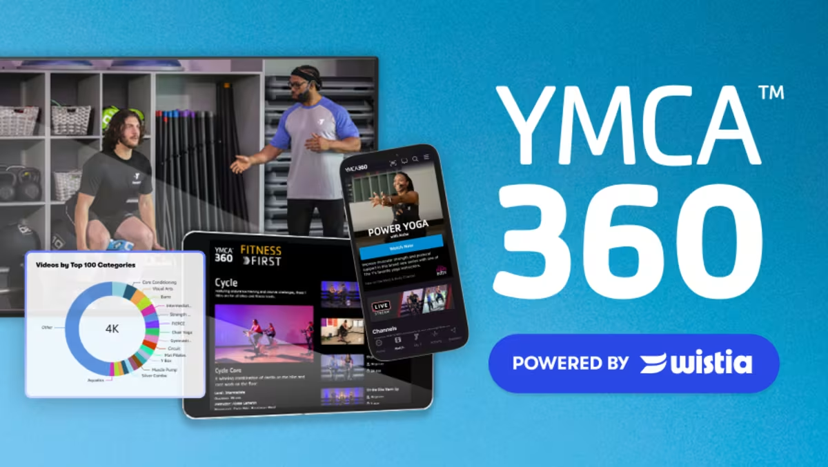
How Wistia Helps the YMCA Manage 4,000+ Videos from Hundreds of Partners
YMCA produces and publishes content from Y partners across the country. See how Wistia keeps their 4,000+ video library organized and their Monday release schedule on track.
The Wistia Team

How Defendify Scaled Their Cybersecurity Webinar Program with Wistia
Defendify had a solid webinar strategy, but an inefficient workflow was holding them back. See how switching to Wistia helped them host more webinars, grow their audience, and build a stronger cybersecurity community.
The Wistia Team
How Reddit Scaled a Webinar Program with Wistia
Reddit’s SMB marketing team turned a content-rich strategy into a scalable webinar program—and they couldn’t have done it without Wistia.
The Wistia Team
Product Comparison
See more
Contrast Alternative: Webinars with Wistia
Learn why Wistia is the better choice to help you get the most out of your webinars.
Sasha Friedman

Wistia vs. Goldcast: Which Webinar Platform Is Better for Marketers?
Wistia and Goldcast serve different needs. Compare the two and find the better fit for your team.
Lisa Marinelli
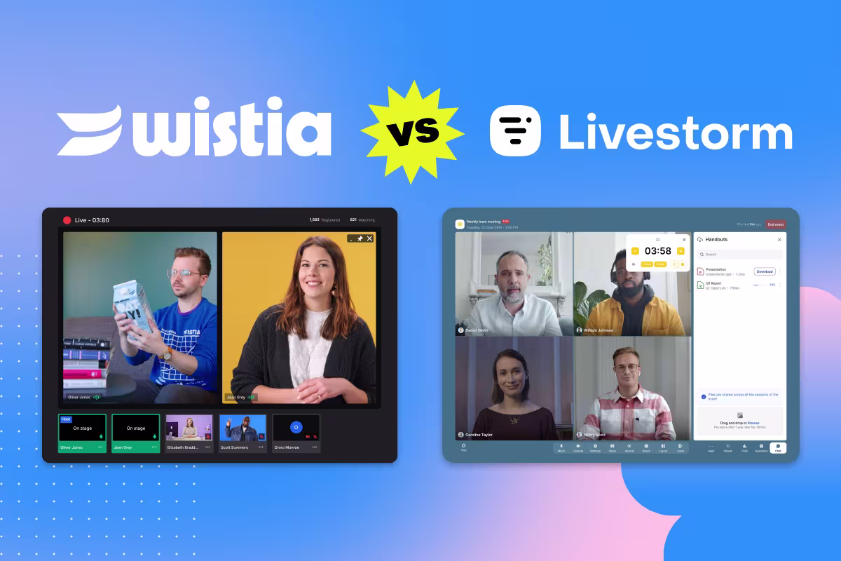
Wistia vs. Livestorm: Which Webinar Platform Is Better for Marketers?
Explore the main differences between these two platforms and choose the right one for your team.
Lisa Marinelli