

Thumbnails. Oftentimes, they’re the last step on your business video journey. We’ve all been there. You’re at the end of your rope, the sun’s going down, and that leftover rice pilaf is calling your name. "This one’ll work," you mutter to yourself.

Yikes. The truth is, despite their underwhelming title, thumbnails deserve your attention. Why, you ask? Because your thumbnail offers a first impression of your video, and a quality one can transform a page and improve play rates!
Without further ado, let’s talk about some common thumbnail mistakes along with some quick fixes.
Mistake #1: Face Fail
Many of us are producing videos of talking heads, which is a wonderful thing! Giving your business a face is an effective way to build a connection with your audience. When it comes to video thumbnails, however, some facial expressions are more flattering than others. In other words, if the default thumbnail makes you look bored by the sound of your own voice, crazed, or less than sober, you should probably choose a new frame. Put your best face forward! Make your Aunt Susan proud!
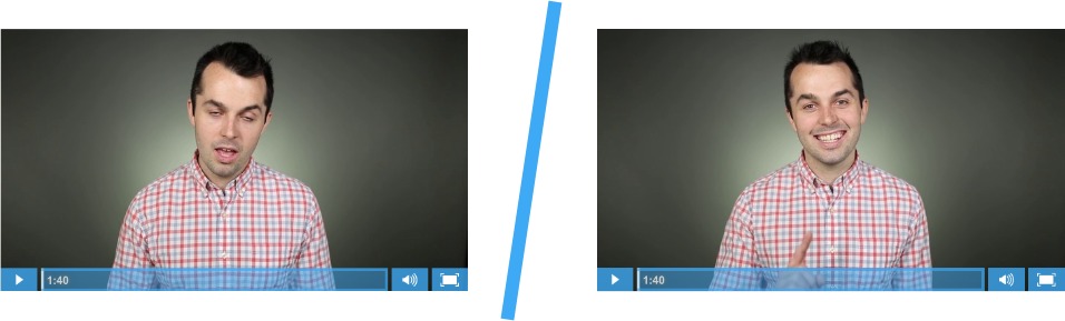
Quick fix: You must be smiling at some point, right? Try to pick a new frame that features a friendly face.
Mistake #2: Dull City
Does your business produce lots of useful screencasts? By using a thumbnail like the one below, you are setting the stage for a boring experience. "Welcome to Dull City, where everything is gray and miserable." It’s true that we want our thumbnails to convey an accurate depiction of the content within the video, but there has to be a better way. For the love of webinars! Put a smile on your audience’s face, or at least give them some human touch to connect with!

Quick fix: Take a photo of the presenter smiling next to their screen, and use that instead. Maybe some Vanna White hands? It doesn’t have to be a large production: you can also upload a colorful title page to serve as the thumbnail.
Mistake #3: Chameleon
This one sneaks up on you like a squirrel at a picnic. Most of the time, you just don’t see it coming.
Our squirrel arrived after we created a new video for our product page earlier this fall. The frame that we really wanted to use for our thumbnail placed James’ laptop screen directly behind the play button. We were concerned that our audience might not recognize the image as a thumbnail leading to a video, so we decided to modify the controls so that the play bar and the small play button would be visible upon page load. This way, it was extra clear that the play button was not just a sweet sign that James happened to be holding.

Quick fix: Use the small play button along with the play bar to clarify that your thumbnail is a video.
All-in-one Video Platform
Create, Edit, And Host Videos
Learn moreMistake #4: Motion Blur
If there’s lots of motion in your video, chances are the default thumbnail includes some motion blur. When the image doesn’t appear sharp or polished, the thumbnail can take away from the look of your whole page or email. Your thumbnail should always suggest high video quality, so unless you are trying to convey a sense of chaos or activity, it’s probably best to change things up.

Quick fix: Select a different frame in the video, in which the subject is sharp as a tack.
Mistake #5: Eye Mask
It’s common to place our subjects in the middle of our frames, but if you’re using a central play button on your thumbnail, you should choose your image accordingly. You know what they say. "The eyes are the window to conversions," or something like that. Don’t deny your audience that instant human connection. Be cognizant of that play button and make purposeful decisions.

Quick fix: Is there a frame where the subject’s eyes are more visible, even slightly? Select that one, instead! If you can’t find a good option that way, consider doing away with the large play button altogether and relying on the small play button in the bottom left corner.
So, what makes a good thumbnail?
It’s important to remember that not every thumbnail deserves the same amount of love and attention. If a thumbnail will be featured prominently on a popular page of your website, you should definitely go the extra mile to make sure it’s the best it can be. At Wistia, we often take photographs specifically for thumbnails, instead of leaving it up to chance in post production.
At this point, you probably already know that it’s wise to include humans (or baby animals) in your thumbnails. Here are some other tactics that we’ve found to be effective:
Convey exciting action. 
Compose a delightful scene. 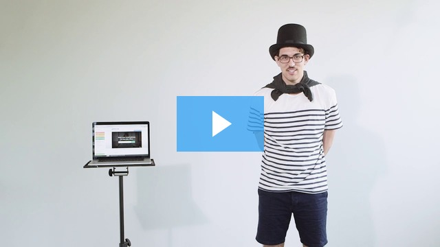
Try something silly. 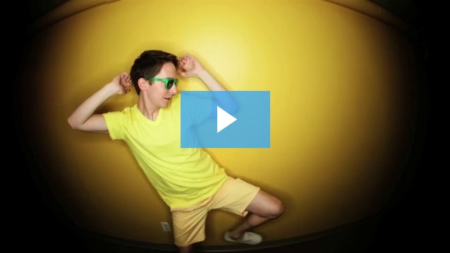
Create an air of mystery. 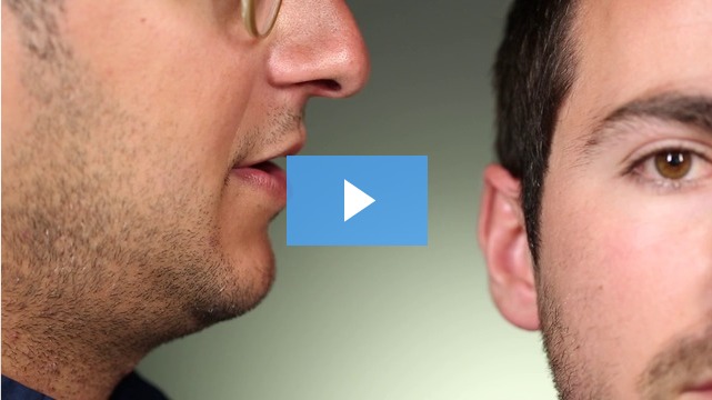
Do you have go-to tactics for your thumbnail images? What’s the best thumbnail you’ve ever created?